Understanding the Basics of Responsive Web Design: Why It Matters
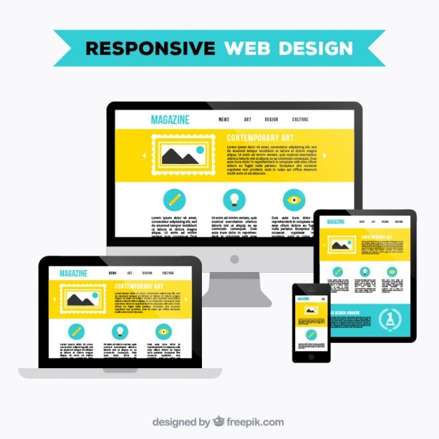
Responsive web design is an approach that ensures your website functions seamlessly across various devices, whether it’s a desktop, tablet, or smartphone. The core principle lies in using flexible grid layouts, images, and CSS media queries to create a fluid user experience. By adopting responsive design, businesses can cater to an ever-growing audience that accesses the internet through different screen sizes, thereby enhancing usability and improving search engine rankings. In today's digital landscape, a website that is not optimized for mobile users can lead to high bounce rates and lost opportunities.
Understanding the basics of responsive web design is crucial for anyone looking to establish a strong online presence. Key elements include:
- Fluid grids: Design layouts that adapt to the size of the screen.
- Flexible images: Utilize images that can scale based on device width.
- Media queries: Implement CSS techniques to apply different styles for different devices.
By integrating these components, you ensure that your website not only looks great but also functions effectively, leading to a better user experience overall.
Top 5 Benefits of Responsive Web Design for User Experience
In today's digital landscape, having a mobile-friendly site is more important than ever. Responsive web design ensures that your website adapts seamlessly to various screen sizes and devices, providing users with an optimal viewing experience. This adaptability not only enhances usability but also helps to reduce bounce rates, as visitors are less likely to leave your site when it functions well on their devices. Furthermore, Google prioritizes mobile-friendly websites in its search rankings, meaning that a responsive design can significantly improve your site's visibility and attract more organic traffic.
Another key benefit of responsive web design is the cost-effectiveness it offers. Maintaining a single, responsive site is far more efficient than managing multiple versions for different devices. This streamlined approach leads to lower development and maintenance costs over time. Additionally, having a unified website enhances brand consistency, allowing your audience to recognize your brand regardless of the device they are using. Overall, investing in responsive web design not only elevates the user experience but also contributes to your bottom line by maximizing reach and engagement.
Is Your Website Responsive? Key Tools to Test and Improve
In today's digital landscape, having a responsive website is crucial for delivering a seamless user experience across various devices. A responsive design ensures that your site adjusts and displays correctly on desktops, tablets, and smartphones, which not only enhances usability but also boosts your site's SEO ranking. To determine if your website is responsive, you can utilize several key tools, such as Google’s Mobile-Friendly Test, which evaluates your site’s mobile compatibility, or BrowserStack, which allows you to test your website on different devices and browsers.
If you find that your website is not fully responsive, consider implementing the following strategies to improve its adaptability: 1. Use flexible grid layouts that automatically scale to fit different screen sizes. 2. Optimize images to ensure they load quickly and adjust accordingly. 3. Implement media queries in your CSS to change styles based on device characteristics. By prioritizing responsiveness, you can enhance user engagement and ultimately drive more traffic to your site.