10 Essential Typography Tips for Stunning Web Design
When it comes to web design, typography plays a critical role in enhancing user experience and conveying your brand's message. Here are 10 essential typography tips to ensure your website stands out:
- Choose Readable Fonts: Opt for font styles that are easy to read across different devices. Sans-serif fonts like Arial or Helvetica often provide greater readability on screens.
- Limit Font Variations: Stick to a maximum of three fonts on your website to maintain a clean and cohesive look.
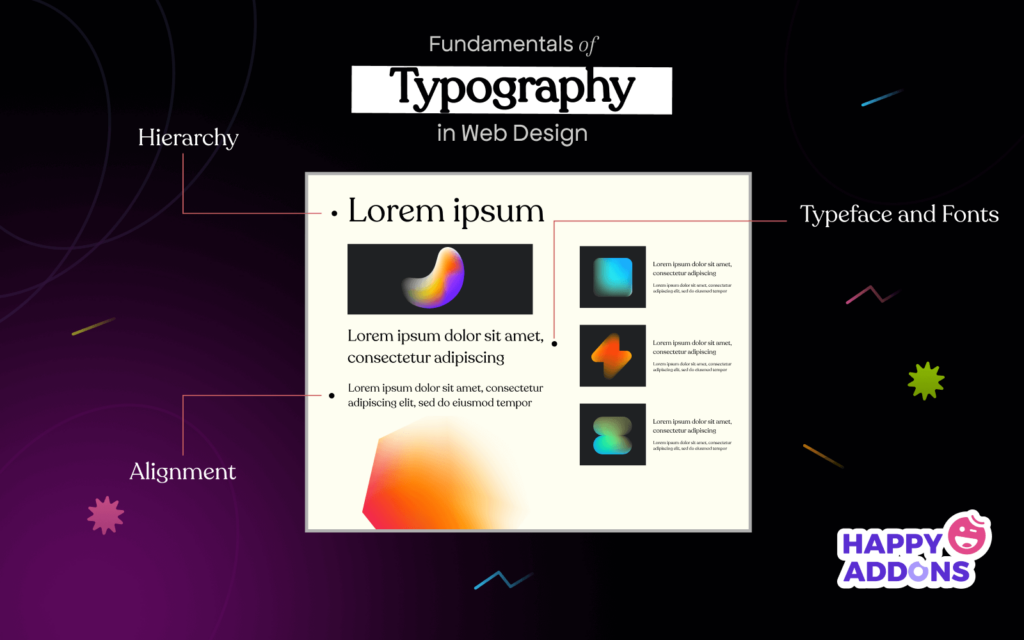
- Establish a Visual Hierarchy: Use varying font sizes, weights, and colors to guide visitors through your content effectively.
- Maintain Consistent Line Spacing: Proper line height can enhance readability. Aim for 1.5 times the font size for optimal spacing.
- Leverage Contrast: Ensure sufficient contrast between text and background colors to improve legibility, especially for body text.
Additionally, consider the following tips to elevate your web design further:
- Optimize for Mobile: Choose responsive fonts that retain readability on smaller screens.
- Utilize Web Fonts: Incorporate web-safe fonts or services like Google Fonts for unique typography options.
- Implement Hierarchical Structure: Use headings appropriately (H1, H2, H3) to create a clear content structure.
- Experiment with Kerning: Adjusting the space between letters can improve the text's overall appearance and readability.
- Test with Real Users: Conduct usability tests to gather feedback on your typography choices and make adjustments as necessary.
How to Choose the Right Font Pairings for Your Website
Choosing the right font pairings for your website is crucial in establishing a clear and engaging visual hierarchy. Start by identifying the primary font that reflects your brand's personality. For instance, a tech company might opt for sleek, sans-serif fonts, while a boutique may prefer elegant serif fonts. Once you have your primary font, consider using a complementary font that provides contrast. Pair a bold header font with a more legible body text font to enhance readability. When selecting fonts, aim for a maximum of two or three families to maintain a cohesive look throughout your site.
Another critical aspect of font pairings is ensuring good accessibility and legibility. Fonts should not only look good together but also be easy to read on various devices. Test your pairings on mobile and desktop platforms to confirm that they maintain their clarity and visual appeal. Additionally, pay attention to the font weights and sizes; creating a clear distinction between headings, subheadings, and body text will guide users through your content seamlessly. Use tools like Google Fonts or Adobe Fonts where you can preview combinations that will elevate your site’s design and user experience.
The Importance of Typography in User Experience: What You Need to Know
Typography plays a crucial role in shaping user experience (UX) on digital platforms. The choice of font, size, spacing, and color can significantly influence how information is perceived and consumed. An effective typographic hierarchy helps guide users through content seamlessly, making it easier for them to scan and digest information. For instance, using larger headings for titles, followed by subheadings and body text, creates a visually appealing structure that enhances readability and keeps users engaged.
Moreover, typography affects the overall mood and branding of a website. Consistency in font choices fosters familiarity and trust, while a well-chosen typeface can evoke specific emotions and reinforce the site's message. Pay attention to your text's line length and spacing, as these elements are critical in maintaining user engagement. In summary, prioritizing good typography not only improves UX but also enhances overall aesthetic appeal, ensuring that users have a positive interaction with your content.